Checking your wrist while enduring yet another poorly-made PowerPoint? Don’t be that presenter! Make your audience sit up in their seats, by avoiding these cardinal misdeeds.
1. Details that require binoculars
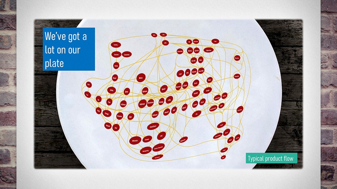
Complex charts, small text or cramped details will make your point vanish. Keep things large, spacious and clear.
You may well have at hand the official organogram, or the business analyst’s actual flowchart. But if it looks like spaghetti, that’s all it’ll mean, too.
Imagery should show important details only, each being large enough to see from the back of the room (including for the 65% of people without 20/20 vision).1 Often, you’re better off recreating a simplified diagram than using a convoluted original.
Greedy presenters try to squeeze too much onto one slide. Instead, focus in on each important detail, in turn, over a series of slides.
2. Too much text
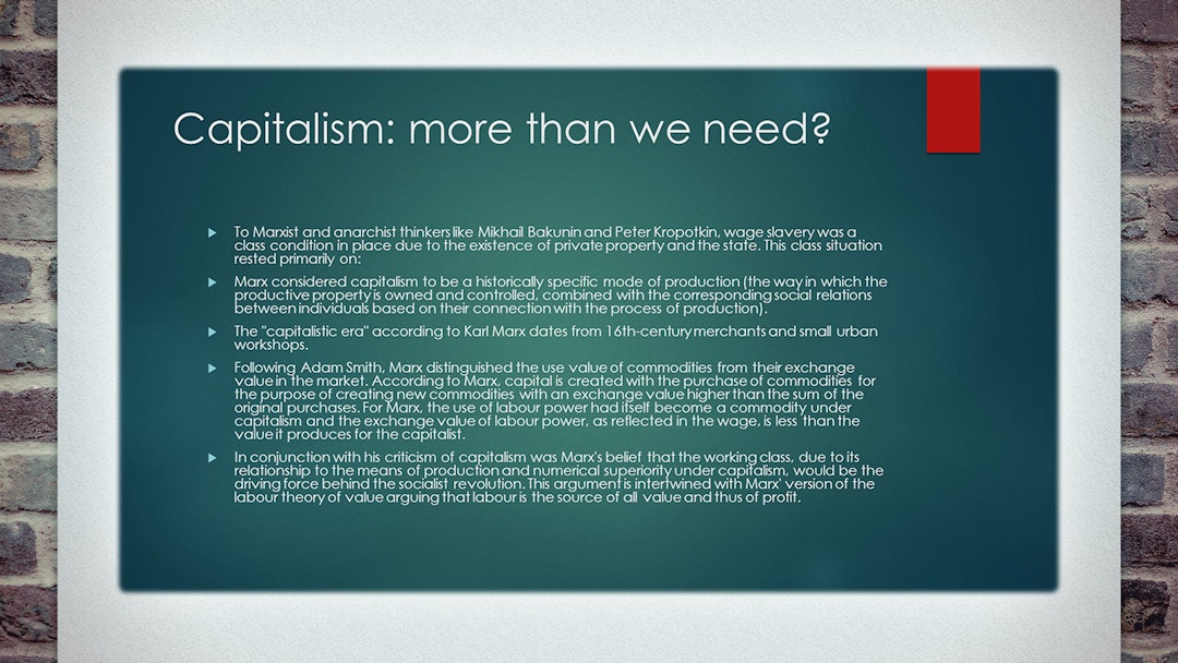
Text-heavy slides send your audience to sleep. Less is more; none is best.
The oldest sin in the book, this should go without saying. But it’s so important – and still so common – that we’re including it anyway.
A glut of words turns a slide into a hymn-sheet. To get away from this, paragraphs should be summarised as sentences. But sentences should also be compressed into keywords; and, if possible, keywords into icons; as far as you can go.
Because, any text on your slide will be read by your audience… while you’re talking. Each distracts from the other, so neither is properly appreciated.
You’re the speaker: you’re the words. Don’t let your slides do the talking.
3. Your favourite memes
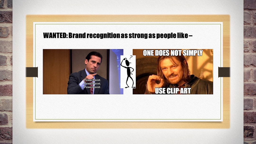
Don’t include random images you found online. But by all means actually be funny.
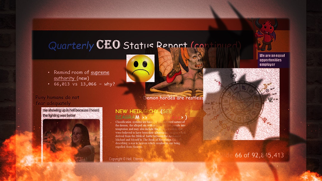
Whether it’s Clip-Art or GIFs, it’s an essentially daft image. On the off-chance it’s amusing, congratulations! — everyone’s distracted.
You are giving a presentation because you’ve got an idea or information worth conveying.2 Simply to convey it is already worth applause. You’ve no need to envy the Internet’s comedic talents.
Accompanied by genuine and contextual humour, your point will be more memorable. But sprinkled with sillies, it will scroll by like a meme.
4. Animations, colours and fonts
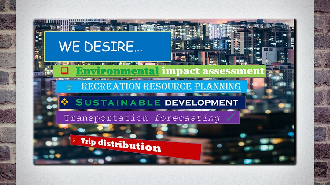
Fancy text and movement don’t make a point any more interesting. Stick to the template.
This will define the font, size, colour and position of headings, text, backgrounds and bullets. Deviating from this disrupts visual consistency — the foundation of good design — leading to presentations that feel erratic.
Even worse is a lust for animation. If every bullet, word and arrow cartwheels into place, the presentation becomes a budget fireworks display. Animation can be used effectively, to reveal an idea step-by-step. If you have the vigour to choreograph this, stick to the ‘Fade In’ effect.
PowerPoint’s tool-belt is packed with colour, font and build options just begging to be clicked. Do not go near them.
5. Stuff plonked anywhere
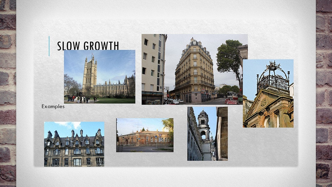
Don’t just paste content anywhere on the slide. Centre it and line it up.
When slide elements appear at slightly different sizes, in slightly different places, the presentation can feel damningly amateur. Especially, in the worst case, when elements overlap, or the screen becomes a scrapbook.
Your template has predefined boxes for content and images. So, don’t be a sloth: make the effort every time you add a new object to crop/resize it to fill the box and keep to the lines.
It only need take a few seconds. And if you learn a few keyboard shortcuts, even less.
6. Lack of structure
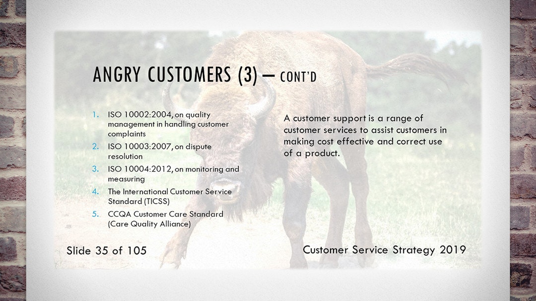
Don’t lose your audience with an unclear structure. Make your flow explicit.
Before you even open PowerPoint, consider what you want to say and how your point will develop. Rearrange ideas now, before you’ve spent time clicking buttons.
Later, use ‘marker slides’ — slides that look strikingly different from your ‘content slides’ (e.g. brightly coloured) — at the logical breaks between sections. This gives a visual cue of your progress into the next topic.
A bull charges in a straight line; you want no such wrath. Be a first-class tour-guide on the journey toward your conclusion.
7. Using your slides as your notes
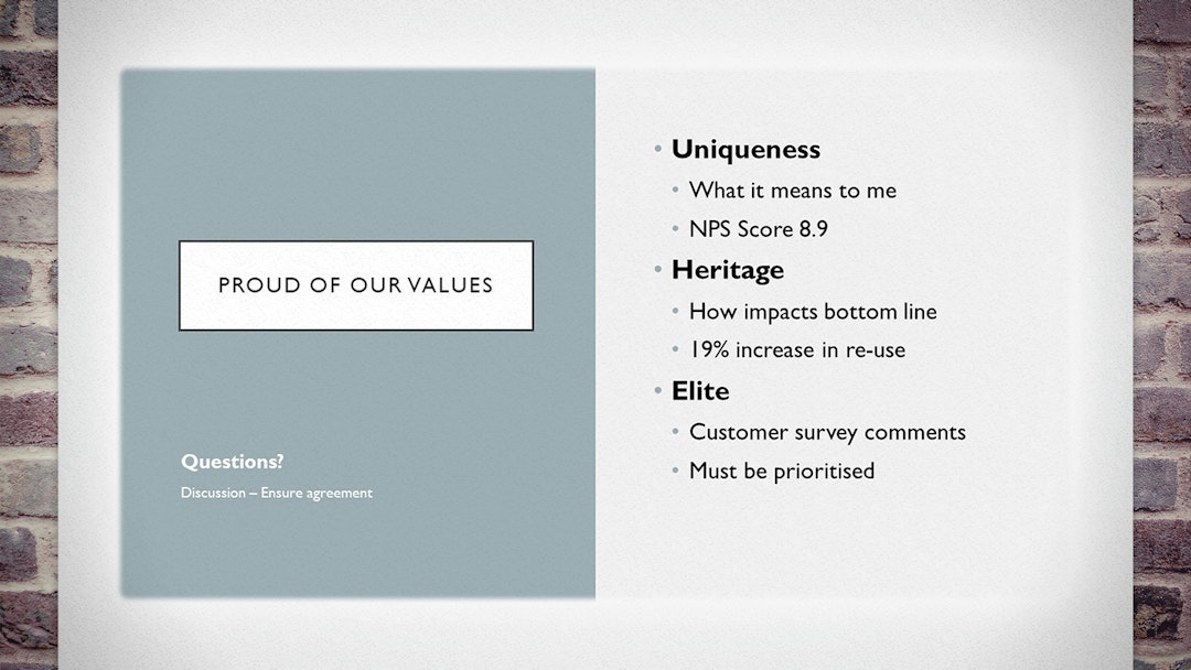
Your slides are not your notes. Don’t use them to remind you what to say; use them to show what you mean.
If you need speaker notes, or need to give handouts, write those separately. PowerPoint offers a dedicated space for this: the ‘Notes’ panel, beneath the slide. (Later, you can print the ‘Notes View’ if you need cues or handouts.)
Slides used as notes reduce the speaker to a translator — from shorthand to long-winded — with little gained in translation. It’s confusing, repetitive and boring.
Worse, it means the slides are really there for your benefit. Which is the wrong attitude entirely. Don’t be proud: the audience isn’t there for you. You’re there for them.
-
What is 20/20 vision?, University of Iowa. ↩
-
If this isn’t true, i.e. your idea/information is not worth conveying… why are you wasting everyone’s time? If the answer is because the boss said so, then their sins outweigh yours, and mercifully shall ye be judged. ↩
Cast your stones
Which presentation sins have you groaned at all too often? Are there more grievous sins we neglected to mention? Let us know your thoughts on one of the networks below.
While you're there, drop a Like or Share if this was useful so we know to write more like it in future.
Creating virtuous presentations free from sin is an art that takes practice. If you’d like us to do it for you, just get in touch.

 LinkedIn
 Facebook
 Twitter
 Medium