QR codes make it easy for people to load your content on their phones – when used correctly. When misused, they’re just ugly squares.
The point of “QR” codes is to get a “quick response”. But if a code is confusing, inappropriate or hard to use, all people will get is quickly frustrated.
Follow the 7 guidelines below to maximise QR code usability, so your audience can scan them effortlessly and take the actions you want.
1. Shorter links mean better codes
If there’s any way to shorten the URL you want people to visit, you’ll get a more scannable code.
If a code isn’t scannable enough, when your audience points their camera at it, it might not do anything.
Shorter links result in codes with fewer pixels. Consequently, each pixel can be larger, making the whole code easier for a mobile phone camera to detect.
URLs can be shortened by deleting unnecessary parts in them:
- Forward slash at the end (e.g. example.com/page
/). - The
sinhttps, if it’s present (e.g. https://example.com) - The
www.at the front, if it’s present (e.g. http://www.example.com) - Anything after
#or?(e.g. example.com/page#sectionor example.com/page?from=referral). - Parts that specify a specific language version of that page (e.g. example.com/
en/page) – with these removed, many sites will default to the user’s local language, which is better anyway. - SEO keywords when there is already a numeric ID (e.g. example.com/page
/all-about-qr-codes/0123456).
These are in roughly increasing order of their likeliness to break the link. So, importantly, ensure you test that the URL still works after you’ve made these deletions.
Use a link shortening service like Bitly as your last resort. These provide ultra-short URLs, but obscure your website’s actual address. (When users scan the code, they will be prompted to visit “bit.ly” rather than your website, which isn’t ideal.)
2. Use black and white or high-contrast colours

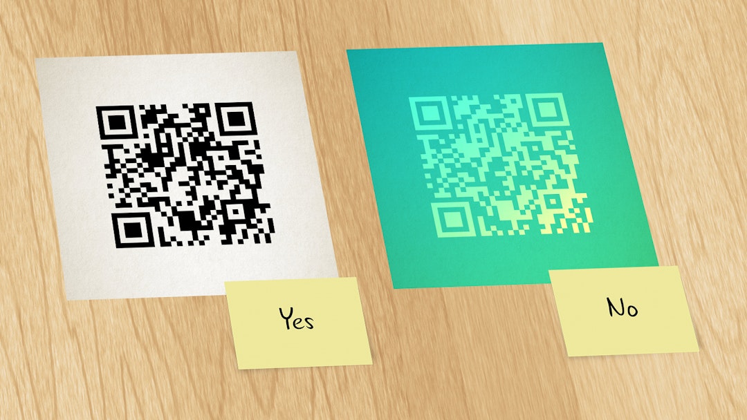
QR codes should be black and white, or use very high-contrast colour pairs.
It’s safe to display a code in a very dark colour (e.g. navy) against a very light colour (e.g. beige), or the reverse. Don’t use more than one foreground colour; and for situations where maximum scannability is crucial, stick to black on white.
The background colour must also extend fully around the code to create a margin. Clear space around the code is as essential as the clarity of the code itself.
3. Keep it square
QR codes should be square, with square pixels. Ignore any services that offer different shapes and styles.
Other shapes, like circles, are a kind of trick. The square QR code is still there, in the centre of the circle, but bits are added or cut off to achieve a different shape. This drastically harms the scannability of the code.
Minor adjustments to the style of the code are possible. For instance, you can slightly round the corner markers or pixels within the code, for a friendlier look; but don’t make them too circular.
4. The code must be big enough

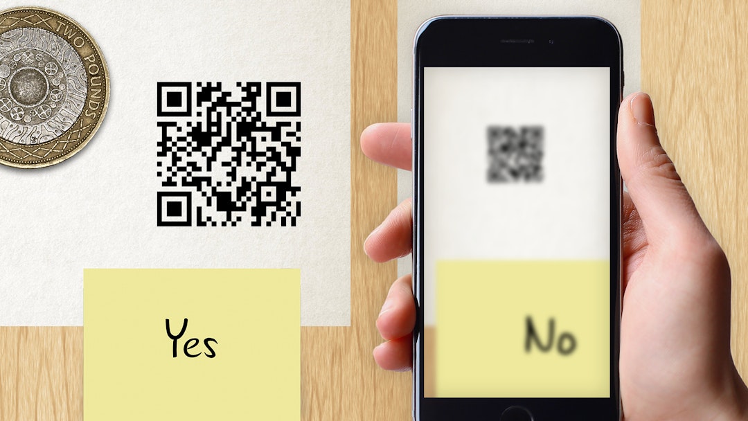
If a QR code is too small, a smartphone camera might not be able to focus on it.
How large a code should be depends on how far away people will be when they use it. The further away, the larger the code. As a rule of thumb, the width of the code should be 1/10th the scanning distance at minimum. See the table below for some examples.
| Physical item | Typical distance | QR code size |
|---|---|---|
| Leaflets, brochures, business cards | 20cm | 20mm |
| A3-A2 wall posters | 30cm | 30mm |
| Signage, A1+ posters | 1m | 100mm |
| On-bus/on-train advert | 2m | 200mm |
If your QR code will appear digitally, you need to make an educated guess about how large it will appear on someone else’s screen.
| Digital screen | Typical screen size | Typical distance | QR code size |
|---|---|---|---|
| Desktop Computer | 22” | 30cm | 6% of the frame width |
| Television | 50” | 2m | 20% of the frame width |
Different QR codes contain different numbers of pixels, so the more pixels, the larger the code needs to be. All of the sizes above assume a code with 29×29 pixels.
Remember, even if you’ve tested a smaller code with your own smartphone and it works, your audience’s phones may not have cameras as good as yours.
5. Always indicate what the QR code does
A QR code on its own has no power. Other design elements are required to turn it into an effective call to action.
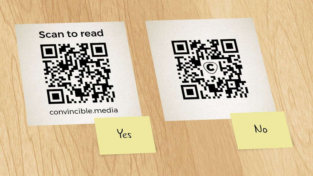
Consider placing text next to the code, indicating what it does. For instance, “Scan to book now”.
Don’t just write “Scan me!” though, as this adds no value – it doesn’t tell you what scanning will do.
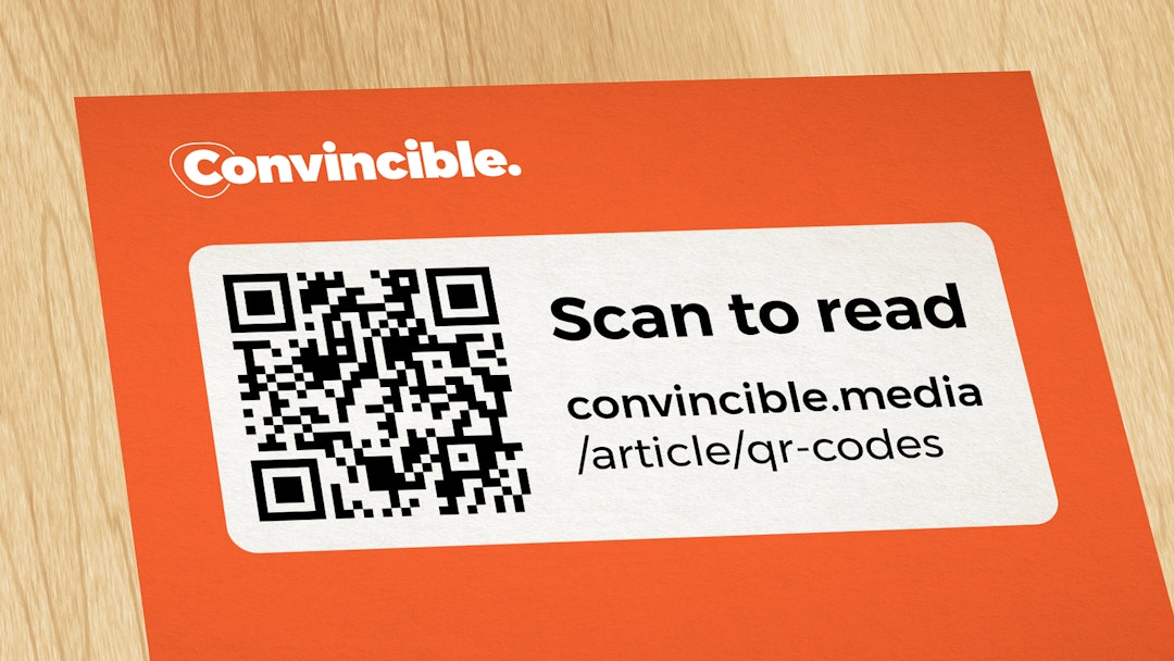
It’s also worth writing down the domain name that the code points to, either separately or as part of the instruction. For instance, “Scan to visit convincible.media”. Someone is more likely to use the code if they know which website it will take them to.
6. Don’t include little graphics

Resist the temptation to make QR codes look more attractive by overlaying or including graphics inside them. These inclusions make the code harder to scan.
Such graphics can be included because because QR codes were designed to be scannable even if part of the code is missing. They’re made for the real world, where bits may get worn off, things might be in the way, or there may not be perfect focus.
Including a graphic in the code is like tearing a bit of your code out in advance. This reduces or eliminates the code’s ability to survive further real-world scanning issues.
7. Don’t make the QR code the only option

Ensure the QR code is an optional convenience.
Ideally you should still include design elements, such as the full web address, that allow people to take your desired action without the code.
Not everyone is comfortable with using QR codes, or knows how they work. Some people’s phones are too old, or the camera could be faulty. Others may prefer to use their laptop, which might be the only device on hand. If you don’t provide a backup option, these people are stuck.
Summary
- Shorter links mean better codes
- Use black and white or high-contrast colours
- Keep it square
- The code must be big enough
- Always indicate what the QR code does
- Don’t include little graphics
- Don’t make the QR code the only option
When, and when not, to use a QR code
QR codes are ideal when:
- Your audience has at least 60 seconds to engage with the design. That gives them 53 seconds to notice your design, decide to read it, and consider acting on it. And then 7 seconds to scan the QR code. (There’s no point showing a QR code on the side of an escalator.)
- Scanning the code is the main thing you want them to do. QR codes are attention-grabbing, so should be used for the primary call to action.
- They feasibly want to do that thing, right now, on their phone. (People aren’t likely to take out a mortgage on the spot.)
- The website the code points to is mobile-optimised.
If any of these four points is missing, a QR code will be ineffective at best, or pointless at worst.
But if they all apply, QR codes offer a powerful way to increase the likelihood that people engage with your design and take the actions you want.
Care to respond, quickly?
If you’re tired of seeing badly-used QR codes, please spread the word by sharing this article. You can do that, and let us know your thoughts on these guidelines, over on:
While you're there, drop a Like or Share if this was useful so we know to write more like it in future.
Do you need materials designed for print? Integrating a QR code properly is just one of myriad design considerations that we factor into all our projects. Get in touch to see how we can help.

 LinkedIn
 Facebook
 Twitter
 Medium